If you've been paying attention to the Shopify help docs you might have noticed that there's a magical new section in the url filters page. This new section talks about how you can create custom images sizes in expect pixel width and height (plus pixel density and cropping)! Let's explore it.

First up - this is big news. There's been some other releases the team has done recently on the quiet, but this is another one that (so far) has had little attention. I am being quite genuine when I say that this release is super exciting. Be sure to give your shout-outs to the developers behind this. Theme devs and merchants will both love this as it's a great step forward for site speed and responsive imagery. Images in Shopify just got better.
If you don't want to read my ramblings just head over to the official page where this is talked about. There's also a great article on the shopify blog. Love it!
The traditional method for using imagery within Shopify themes was to pick from a predetermined selection of sizes from Pico all the way up to the Master. This worked really well in some ways since all images would always be from a known group. Design decisions could be simplified with that knowledge. It didn't always bode well when there was a need for speed optimisations or more precise pixel sizing.
I've looked at using services like imgix before (which is still great tool fyi) but Shopify has really closed that gap.
So what's new?
Instead of using a named image size (like Pico), you can specify an exact size in pixels for the width, height (or both) of the image. The image's original aspect ratio will be preserved, and you can also throw cropping into the mix. Jump to the help docs that talks about cropping.
One important thing to note is that no matter what size you ask for it will never be returned bigger than the original. If you want those sexy looking images it's going to pay to upload them as large as possible. Nothing will be upscaled.
Pixel density is a cool bonus to this new feature, as is the ability to set what file format is to be used. What the latter means is that you've got the option to choose between jpeg or progressive jpegs (pjpg).
Example Time!
Let's start with the image attached to this article in '1024x1024' size: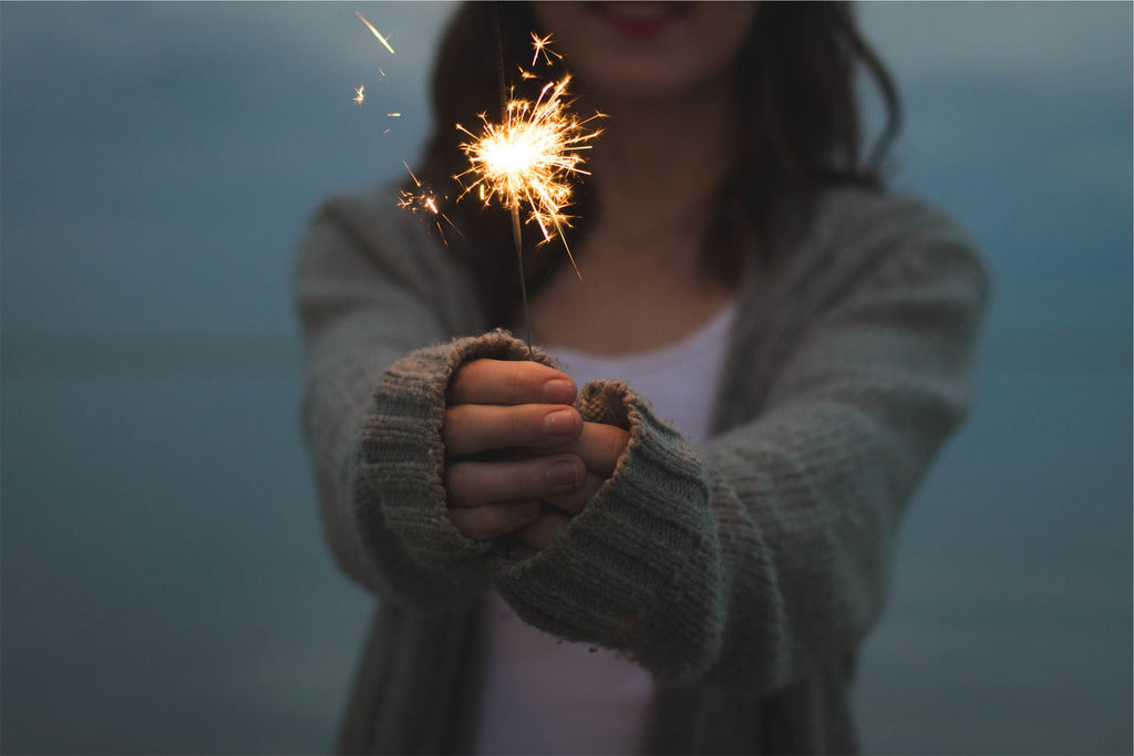 {{ article.image | img_url:'1024x1024' }}
Now we can use the same image but this time using a set width. Something odd like 666px wide (with auto height) {{ article.image | img_url:'666x' }}
Or maybe you just want a set height, like 404 (with auto width)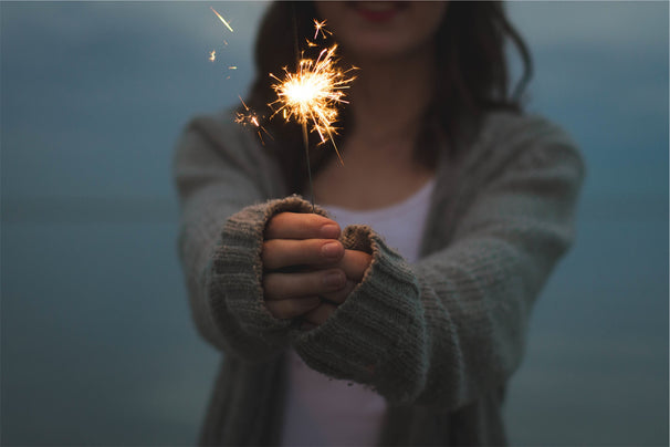 {{ article.image | img_url:'x404' }}
You might want to use progressive jpegs on that... {{ article.image | img_url:'x404', format: 'pjpg' }}
Feel like cropping it?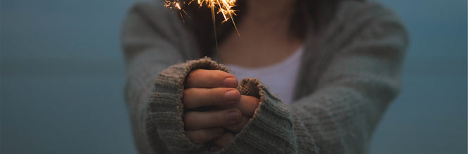 {{ article.image | img_url:'666x220', crop:'center' }}
Crop to the top instead? (much better for this pic!)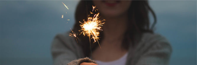 {{ article.image | img_url:'666x220', crop:'top' }}
Or maybe just double density. {{ article.image | img_url:'333x', scale:2 }}
And that's that. Enjoy!
I'll make a follow up article (eventually) on how we can make use of these new image filters with a liquid snippet for creating responsive images - and the HTML needed.
Bonus
Just because I can here's a silly script that will randomly create an image with various proprties. Click on that Get random Image button below.